Posts

PORTFOLIO

Image
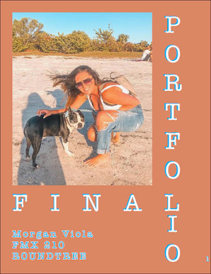
Hours worked: 5 hours of tears Artist Statement: It's finally here, my final portfolio. It's really interesting to see all your hard work pay off and see it represented in a book. I enjoyed this project, I was Editor and Chief of my high school yearbook when I was in high school so this brought me back to the good old days. I decided to create my own theme, it was less complicated and allowed me to be my own creative director. I would say I'm a minimalist so I kept certain items very simple. I kept the colors to three, paper white, a nice turquoise blue, and a terracotta orange. Originally the orange was yellow but I changed it so the white text was more legible. The only font used for this was American Typewriter, my absolute favorite font. I tried to have a variety of different looking pages all while making sure it looked cohesive. I hope others can see the hard work I put into this and be proud of their own like I am of min

Bizzzzznes Card

Image
ARTIST STATEMENT: This is my business card. Super basic, just like me. Depending on the business I don't believe these cards should be so crazy. I have my contact name and logo on the card.

GIF

ARTIST STATEMENT: I really enjoyed this project, working with video in photoshop. I went through a few trial runs with choosing this video. I had one that involved swimming of fish, a baby on a playground, and ended with this one. I think it turned out fairly well with the exception of tis little blurry hiccup. There is some difficulty when changing the opacity and you can see that in the psd version. When I try to change the second keynote to 0% it either stays at 100 or changes all the keynotes to 0. Other then that I believe the movement of the waves and the standstill of the boats turned out really well.

P5 Mesh

Image
ARTIST STATEMENT: For my new gradient mesh project, I chose to recreate pink daisy's. Daisy's are my favorite flowers, and normally white I chose the color pink so when creating the mesh, it gives the flower a 3D look. making it look real. I created two types of petals, one having the rows and three columns while the other had 4 rows and three columns. I used the same colors on each point but scattered them differently among the two petals. I wanted to give variety to the flower so each petal didn't look identical to one another. There was no particular placement in which petal went where. I wanted them scattered to look more natural.  

AUTOSCOPY

Image
ARTIST STATEMENT: This assignment was something I was really looking forward to altering an image and make it look like a different dimension. The original photo is a selfie of my best friend an I at a music festival, we both have scarves and masks covering our face. The color reflecting off our faces is emphasized by the lights but what draws me to this picture is our big and beautiful brown eyes.     For this project, I created masks around our scarves and eyes. I then put a black and white optical illusion replacing the deleted images so it contrasts well off the colored image. The image itself I wanted to make more bright and bold so I toyed around with the vibrancy and saturation. As well as placing a photo filter of purple on the image to strengthen the colors of the pink and blues. I added text in an American Typewriter font that reads, "It's all in your HEAD." I chose to write a quote there so you can imagine that what you're seeing is all in your head.

MEME

Image
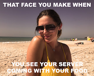
ARTIST STATEMENT: As suggested, for my meme project I recycled the photo I used from my poster assignment. In this picture I tried to play off a cute side smirk that shows interest and temptation. I thought it'd be humorous to pair the two together for something fun and playful. At least I do this in real life when I see my server when I'm out to eat. Who doesn't get excited when their food is out and ready to eat.    This project took me less then ten minutes to construct. I slightly cropped the photo. Put an orange photo filter on the image with light density. The white text I used is regular Arial Black with 100pt font size.

Somewhere

Image
Artist Statement: For this project, I used a picture of my friend Nina from New Orleans, cut her out using the pen tool, and placed her body on a picture from a music festival I took last year. To make her appear like she is actually in the original photo, I toyed around with the vibrance tools, saturation, contrast, and saturation.